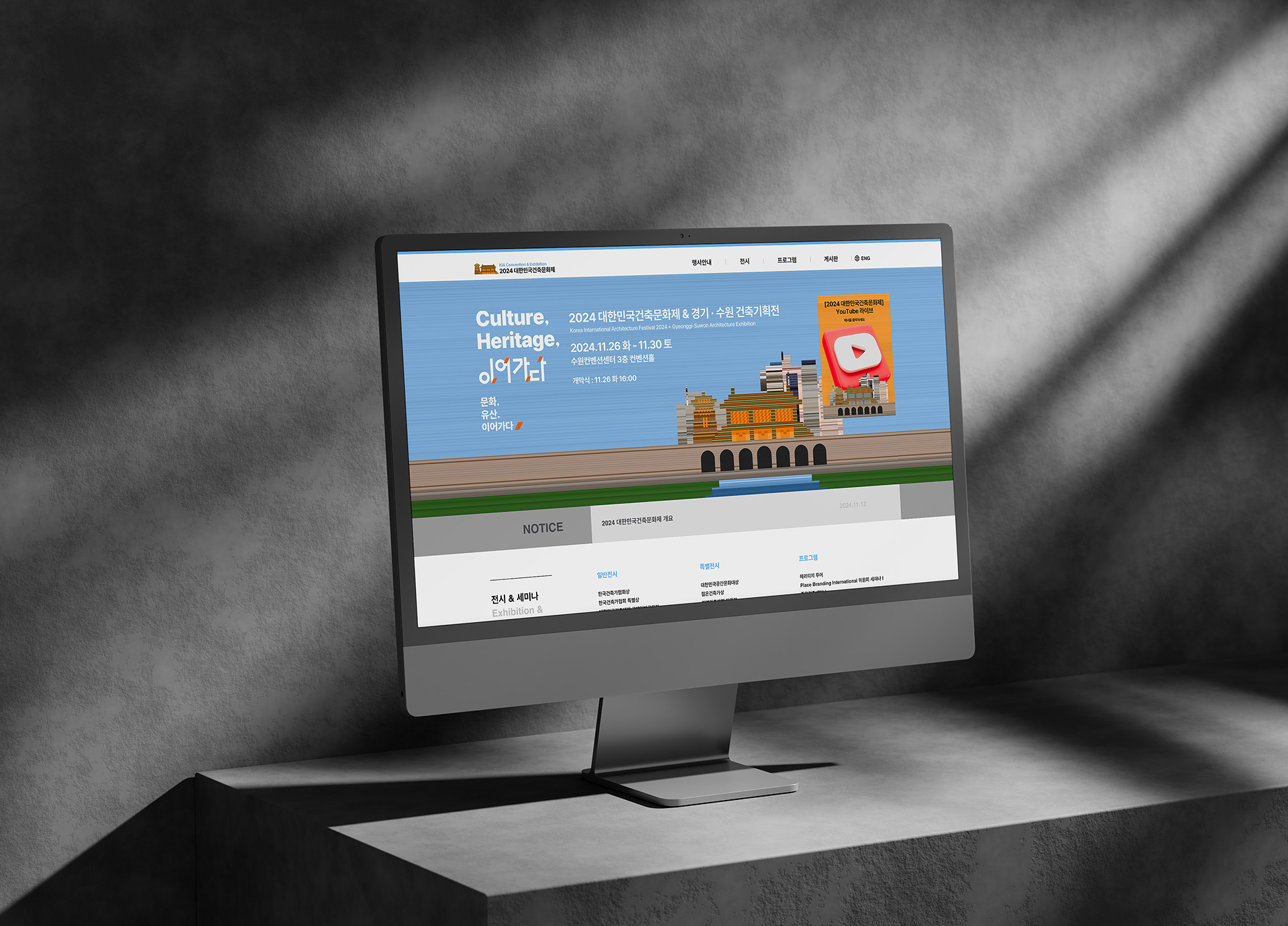
2024 Korea Architecture Culture Festival & Gyeonggi–Suwon
Architectural Exhibition
Architectural Exhibition
《Culture, Heritage, 이어가다》
2024 대한민국건축문화제 & 경기·수원 건축기획전은 도시와 일상 속에 축적된 문화(Culture) 와 유산(Heritage) 을 새롭게 바라보는 전시입니다. 사라졌거나 남겨진 흔적, 세대를 거쳐 이어진 변화들을 통해 건축이 품은 시간성과 서사, 그리고 ‘이어가다(Continuity)’의 가치를 탐구합니다. 과거와 현재가 교차하는 지점을 조명하며, 오래된 것과 새로운 것 사이의 틈에서 문화가 어떻게 지금 이 순간 다시 살아나는지를 보여줍니다. 이를 통해 단순한 보존을 넘어 앞으로 이어가야 할 문화의 방향을 상상하게 합니다.
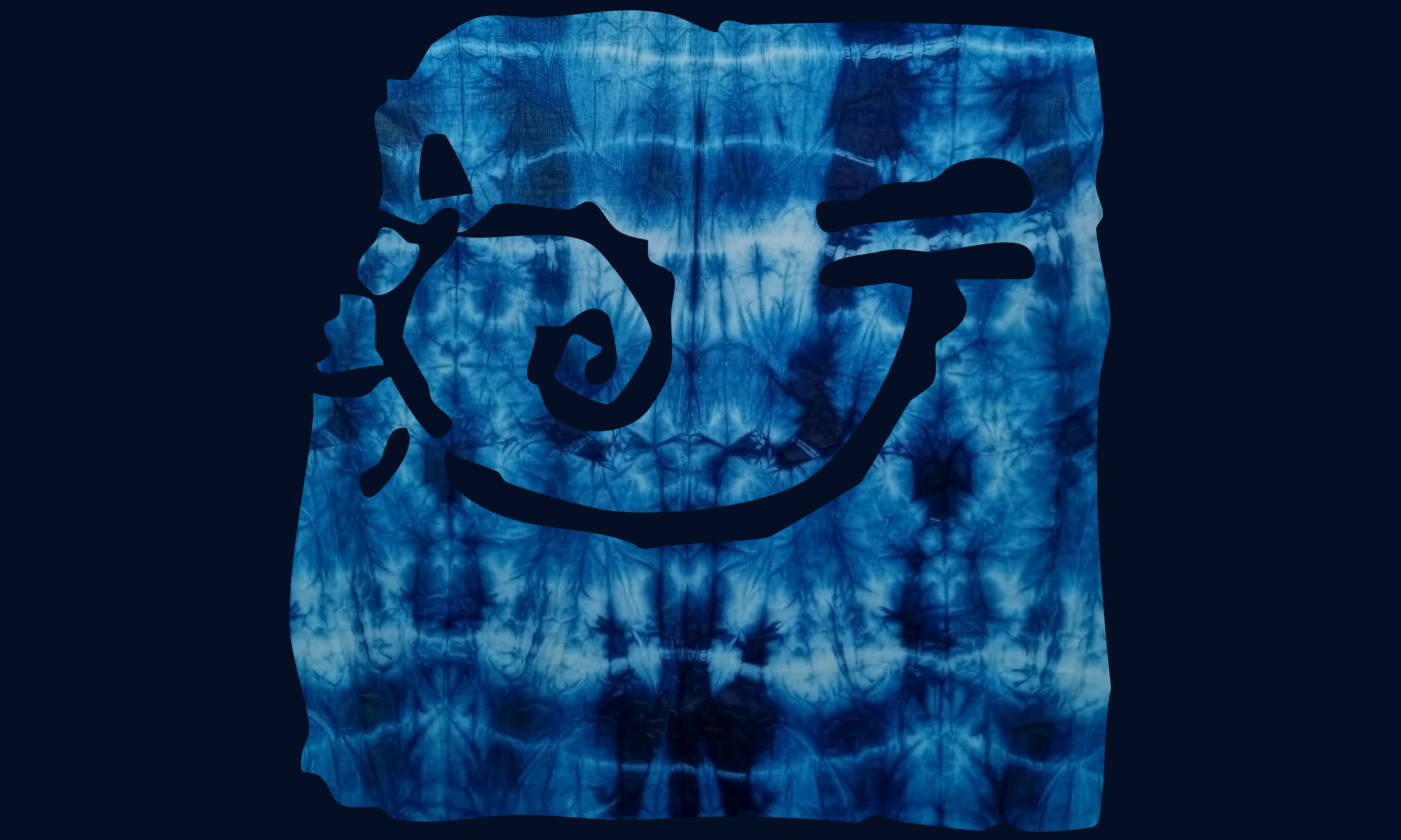
소울브레드는 이번 전시의 비주얼 아이덱티티와 그래픽 요소를 개발했습니다. 레이어, 색, 형태를 겹치고 해체하는 방식으로 문화유산의 결을 현대적으로 재해석하며, 흐름과 생성·소멸의 리듬을 시각화했습니다. 이 작업은 문화유산이 과거에 머무는 것이 아니라, 현재를 거쳐 미래로 이어지는 살아 있는 흐름임을 보여줍니다.
전시관련 뉴스 ↗
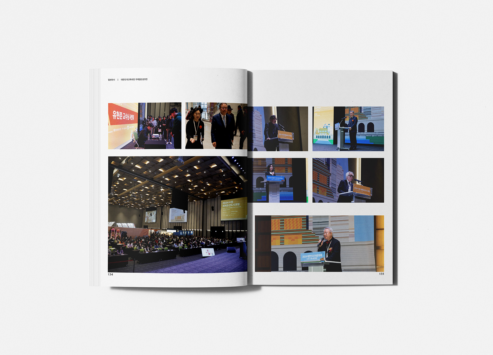
The 2024 Korea Architecture Culture Festival & Gyeonggi–Suwon Architectural Exhibition reexamines the culture and heritage embedded in everyday spaces. By tracing the remnants, changes, and narratives passed down through generations, the exhibition explores the temporality and continuity inherent in architecture. Highlighting the point where the past meets the present, the exhibition reveals how culture is revived and reinterpreted in the “here and now,” inviting viewers to imagine the values that must continue into the future.
SoulBread developed the exhibition’s visual identity and graphic motifs, reinterpreting cultural layers through the layering and deconstruction of forms, colors, and textures. The design expresses movement and rhythm, emphasizing that cultural heritage is not static but a living continuum that flows into the future.
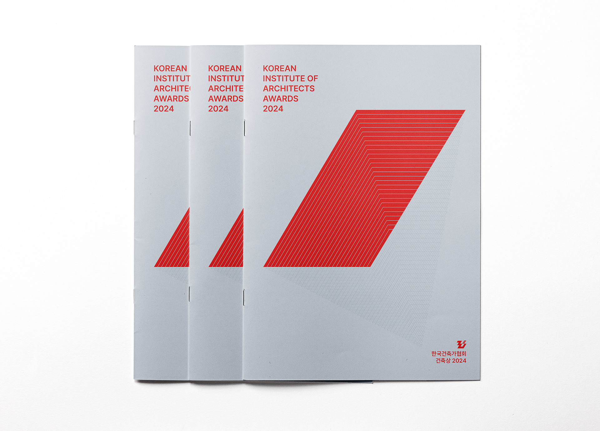
CLINT. 한국건축가협회
DESIGN. 소울브레드
소울브레드는 이번 전시의 비주얼 아이덱티티와 그래픽 요소를 개발했습니다. 레이어, 색, 형태를 겹치고 해체하는 방식으로 문화유산의 결을 현대적으로 재해석하며, 흐름과 생성·소멸의 리듬을 시각화했습니다. 이 작업은 문화유산이 과거에 머무는 것이 아니라, 현재를 거쳐 미래로 이어지는 살아 있는 흐름임을 보여줍니다.
전시관련 뉴스 ↗
The 2024 Korea Architecture Culture Festival & Gyeonggi–Suwon Architectural Exhibition reexamines the culture and heritage embedded in everyday spaces. By tracing the remnants, changes, and narratives passed down through generations, the exhibition explores the temporality and continuity inherent in architecture. Highlighting the point where the past meets the present, the exhibition reveals how culture is revived and reinterpreted in the “here and now,” inviting viewers to imagine the values that must continue into the future.
SoulBread developed the exhibition’s visual identity and graphic motifs, reinterpreting cultural layers through the layering and deconstruction of forms, colors, and textures. The design expresses movement and rhythm, emphasizing that cultural heritage is not static but a living continuum that flows into the future.
CLINT. 한국건축가협회
DESIGN. 소울브레드
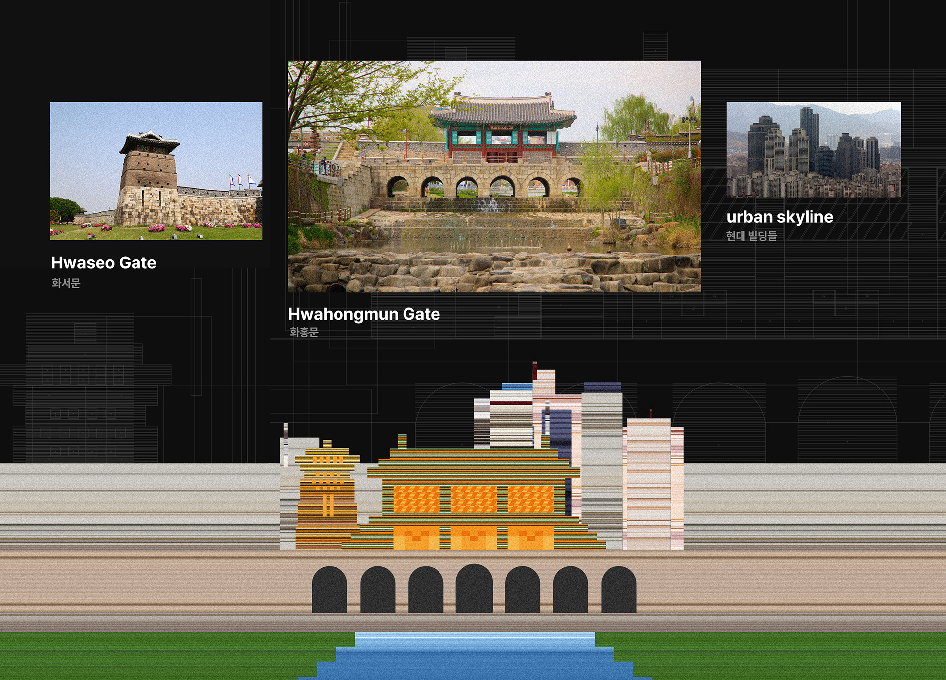
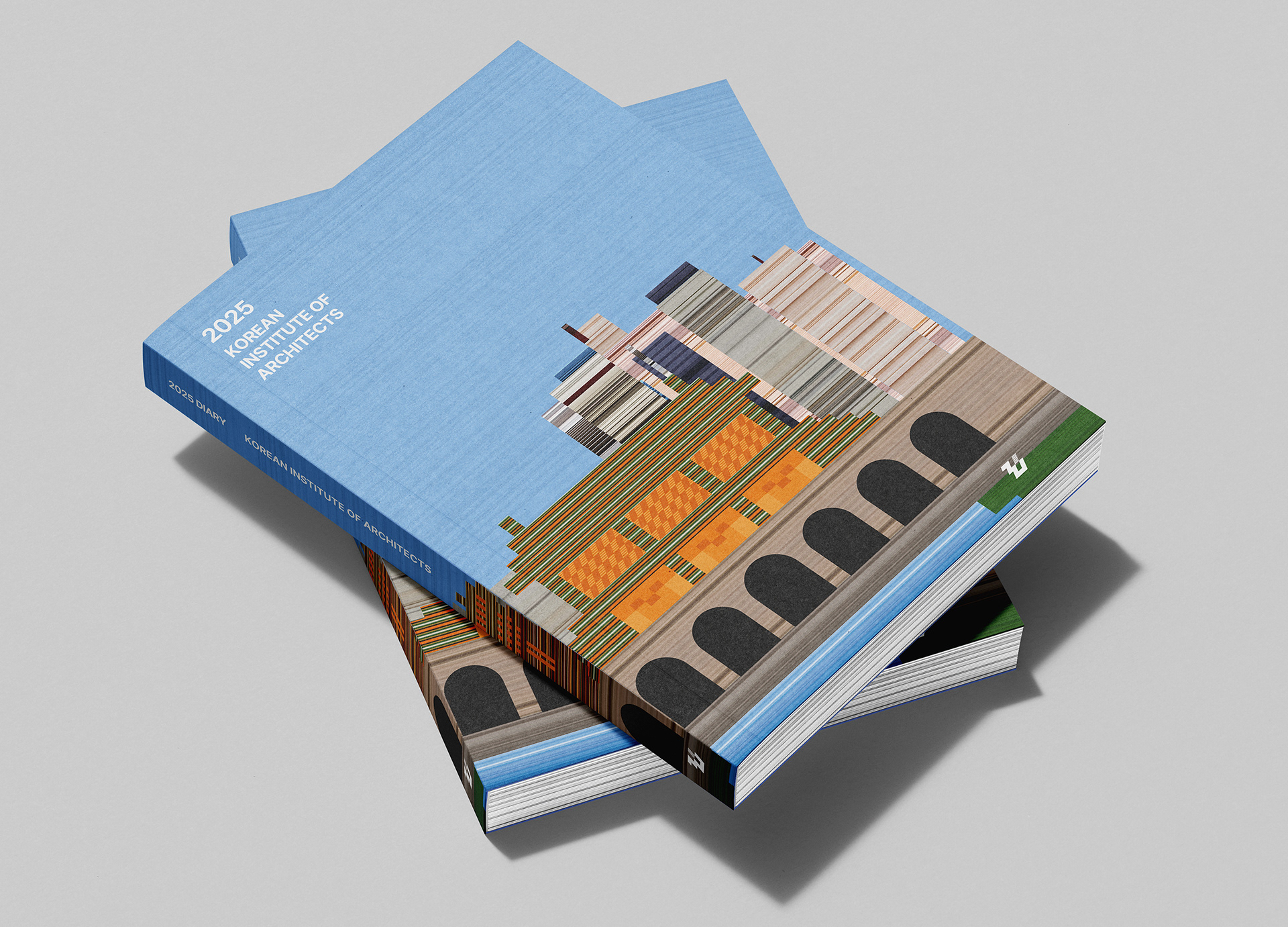
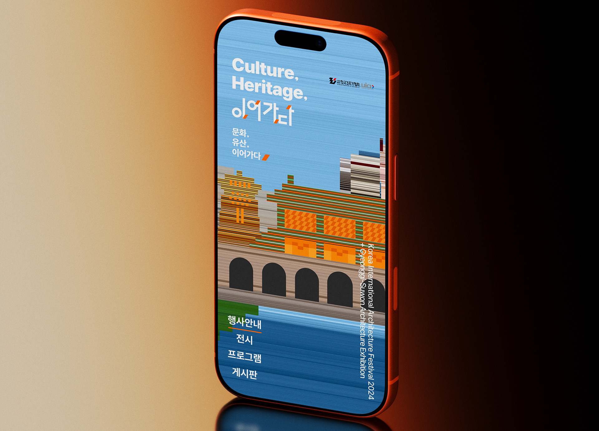
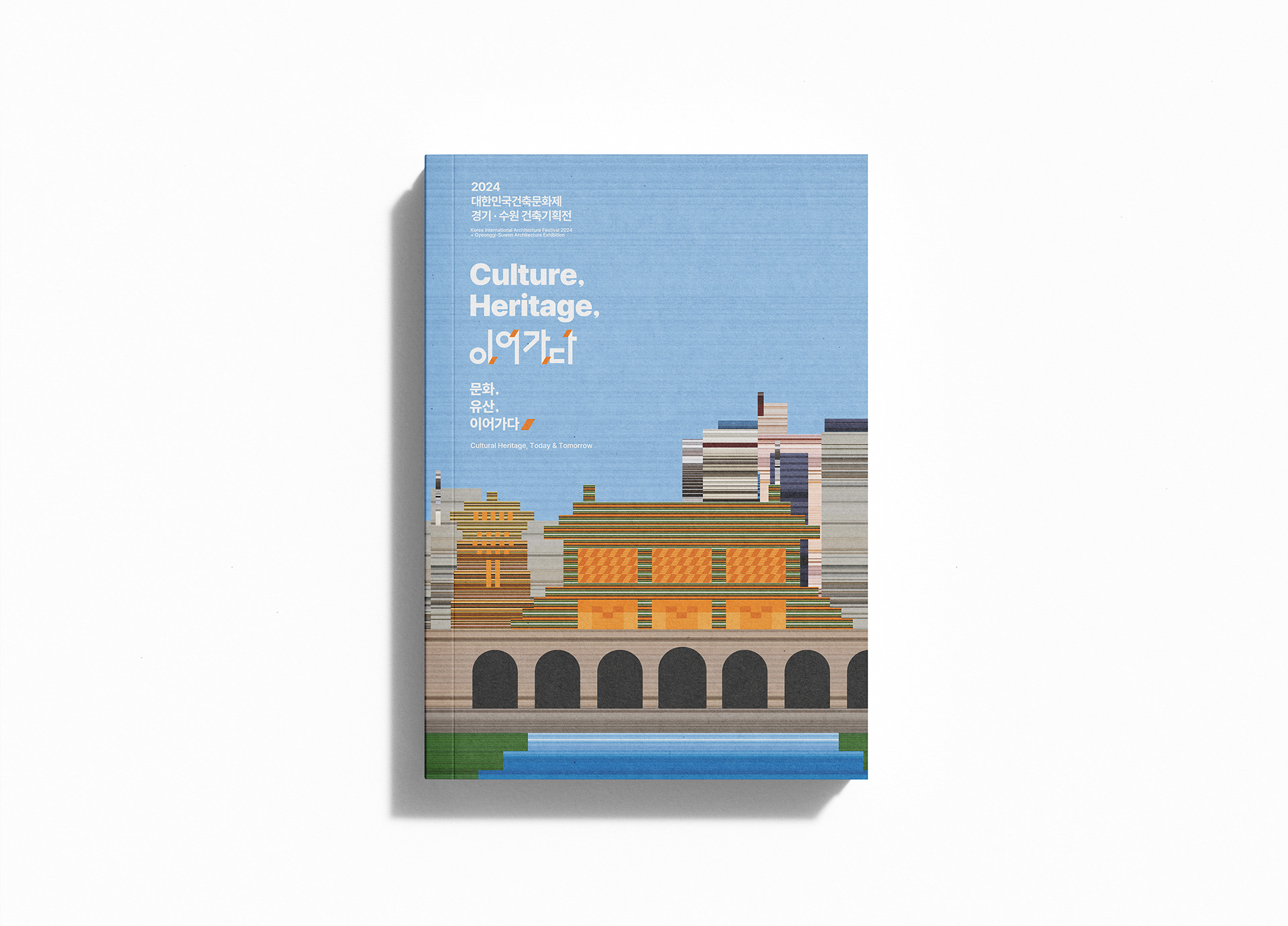
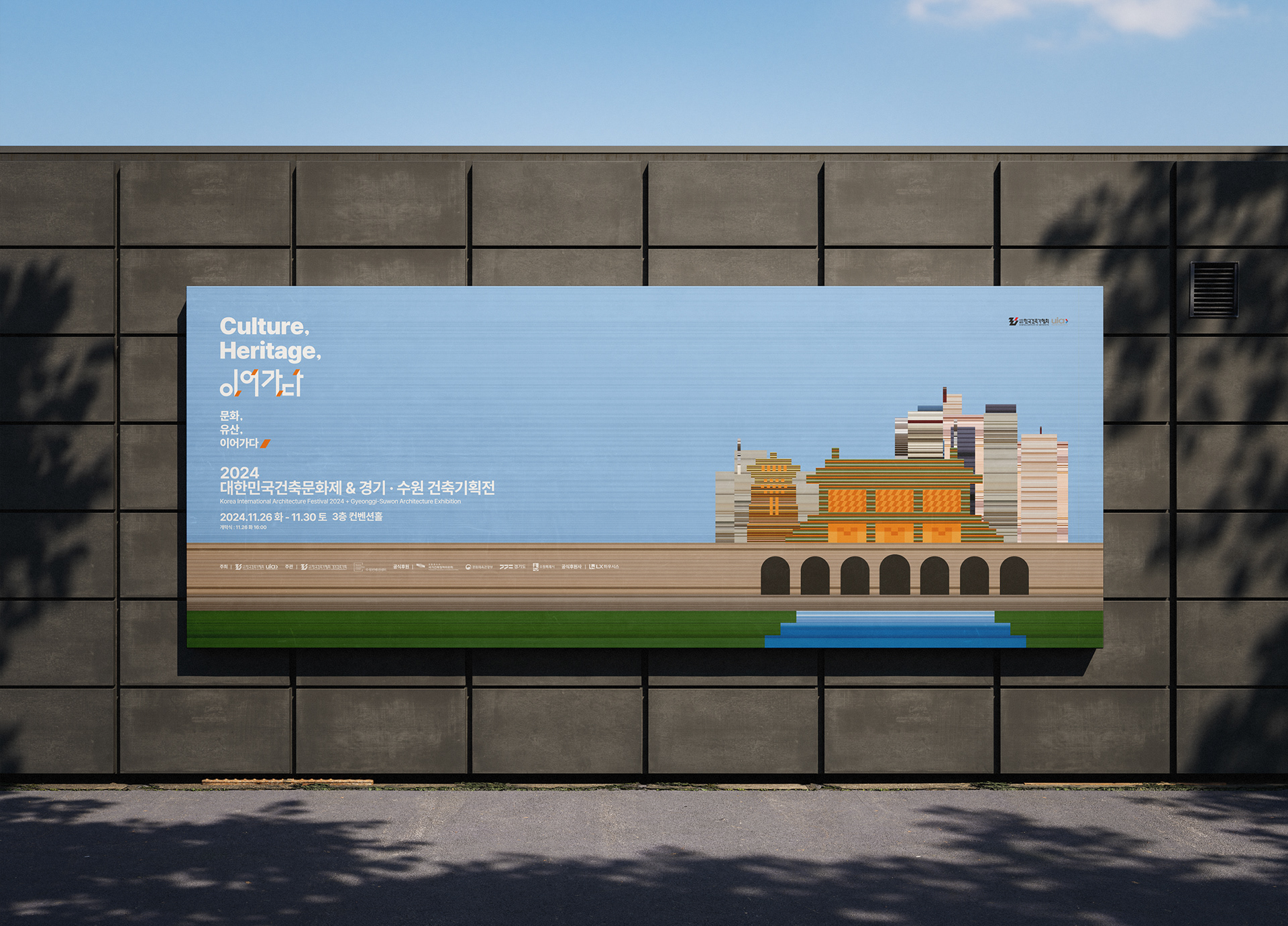
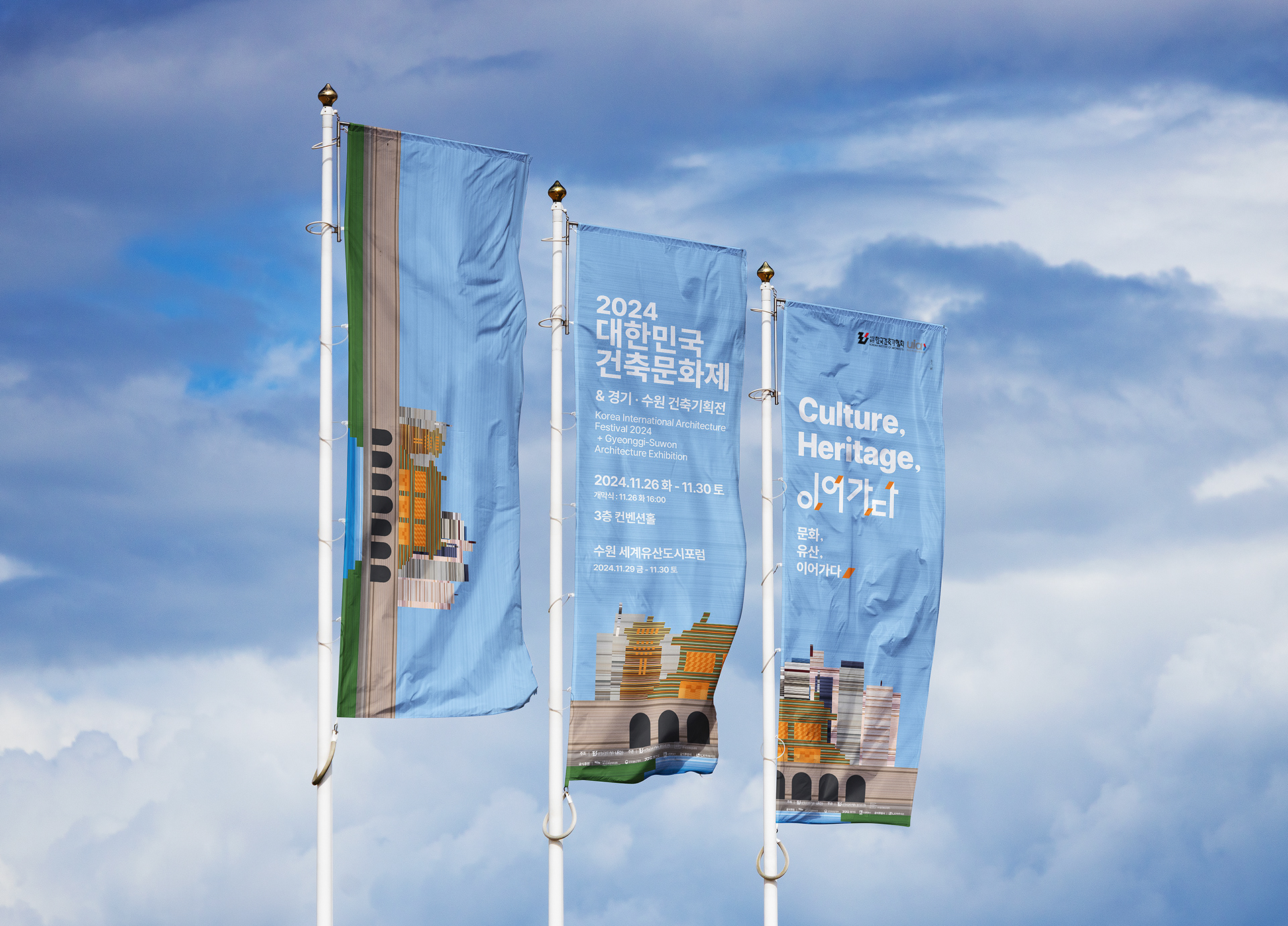
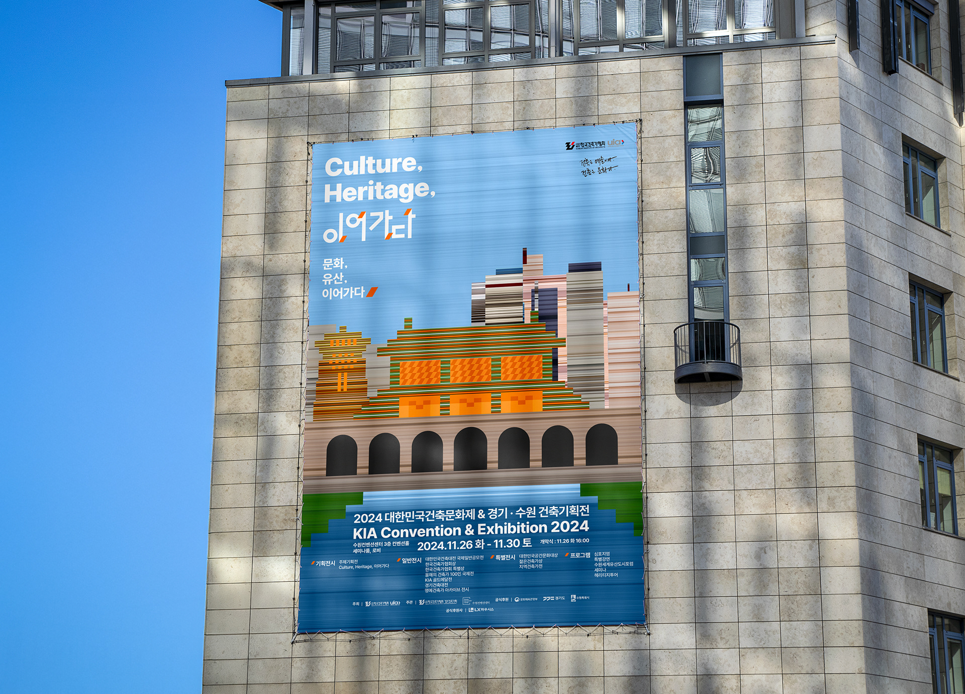
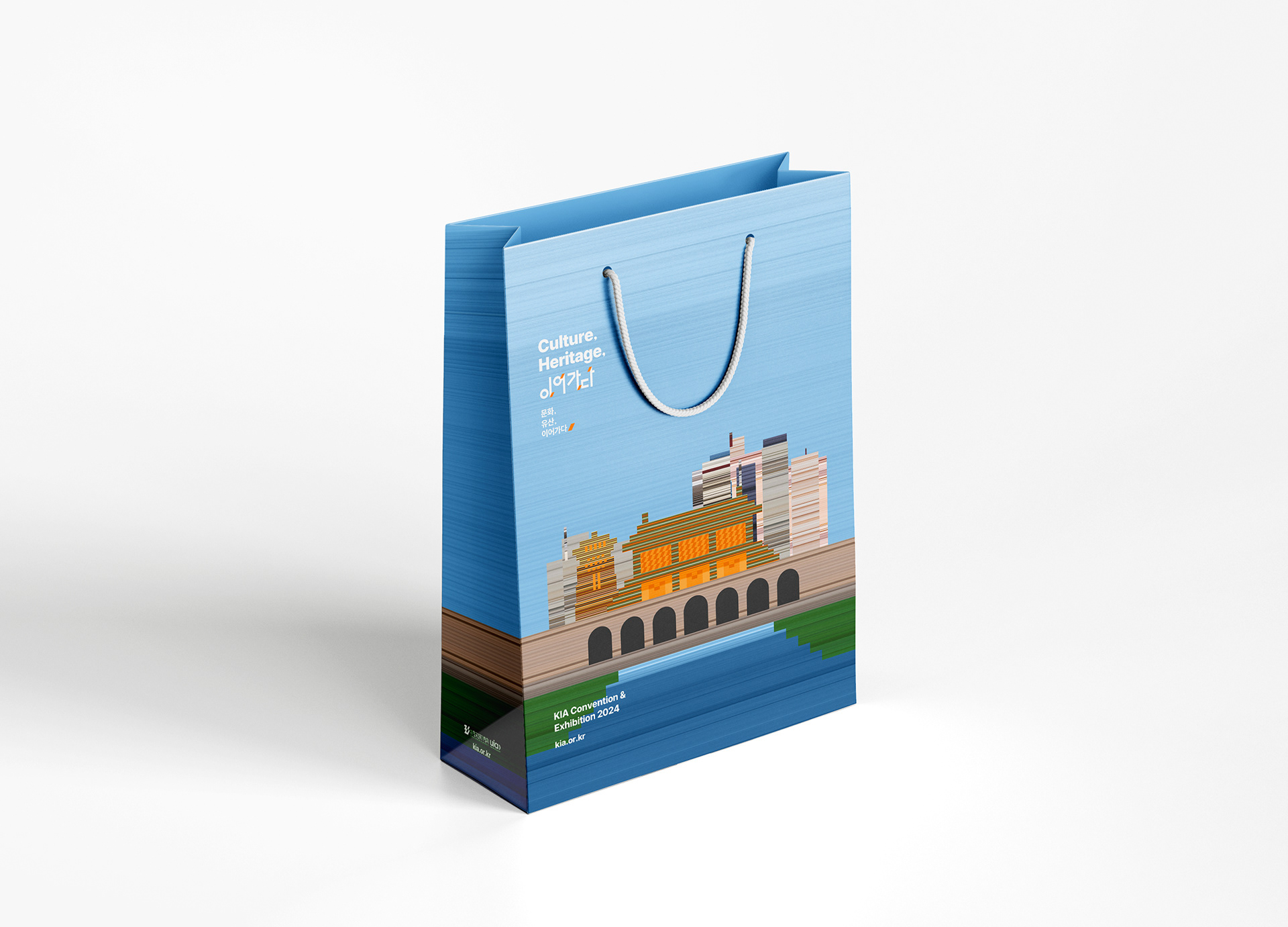
그래픽 모티브 / The graphic motif
이번 전시의 그래픽 모티브는 화서문, 화홍문 그리고 현대의 빌딩 숲을 주요 구성 요소로 삼아 제작되었습니다.
이는 수원의 정체성을 상징하는 유네스코 등재 문화유산(화서문·화홍문)과 오늘의 도시 풍경을 구성하는 현대 건축물을 하나의 시각 언어로 연결함으로써, 전시의 핵심 주제인 “Culture, Heritage, 이어가다”를 상징적으로 표현합니다.
이는 수원의 정체성을 상징하는 유네스코 등재 문화유산(화서문·화홍문)과 오늘의 도시 풍경을 구성하는 현대 건축물을 하나의 시각 언어로 연결함으로써, 전시의 핵심 주제인 “Culture, Heritage, 이어가다”를 상징적으로 표현합니다.
전통 성문의 구조가 지닌 안정감과 역사적 깊이, 그리고 빌딩 숲의 수직적 리듬과 현대성이 함께 배치되며,
과거에서 현재로, 그리고 미래로 이어지는 건축의 흐름을 시각적으로 드러냅니다.
이 모티브는 유산이 단절된 기억이 아닌, 현재 속에서 계속 확장되고 재해석되는 살아 있는 문화의 맥락임을 상징합니다.
과거에서 현재로, 그리고 미래로 이어지는 건축의 흐름을 시각적으로 드러냅니다.
이 모티브는 유산이 단절된 기억이 아닌, 현재 속에서 계속 확장되고 재해석되는 살아 있는 문화의 맥락임을 상징합니다.
The graphic motif for this exhibition is composed of three key elements: Hwaseomun Gate, Hwahongmun Gate, and a modern urban skyline. By integrating Suwon’s UNESCO-designated heritage with the vertical rhythm of contemporary architecture, the design visually embodies the exhibition’s core theme: Culture, Heritage, Continuity.
The structural solidity and historical depth of the traditional gates are juxtaposed with the dynamism and modernity of the skyline, symbolizing the seamless flow of architecture from past to present, and into the future. This motif highlights cultural heritage not as a static memory but as a living context that continues to evolve and reinterpret itself within today’s built environment.
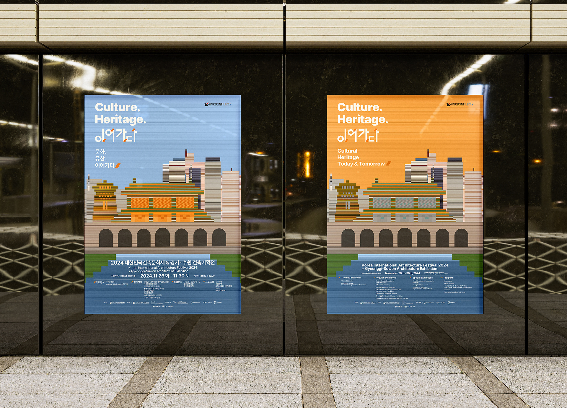
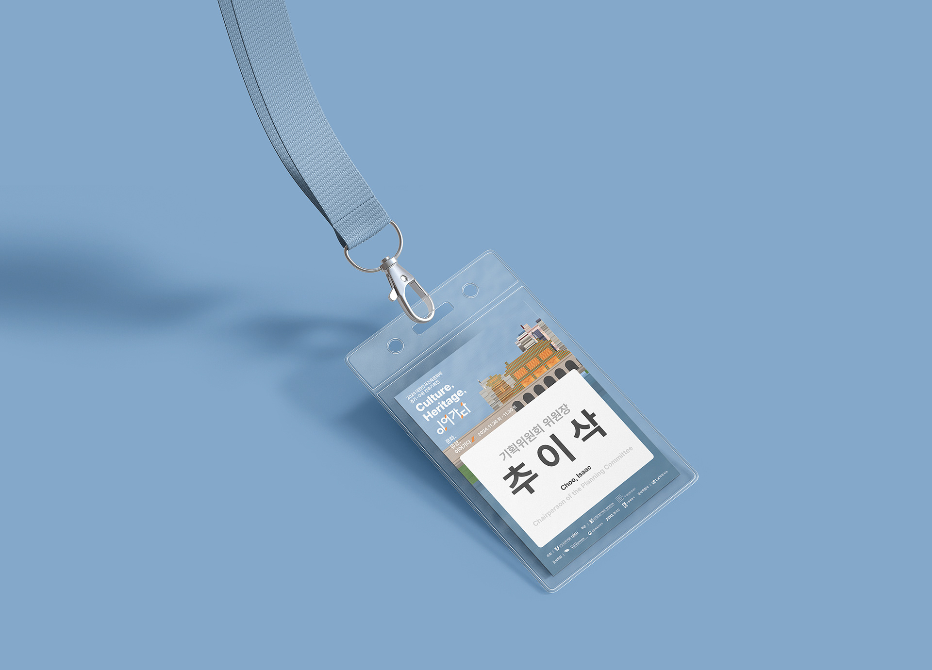
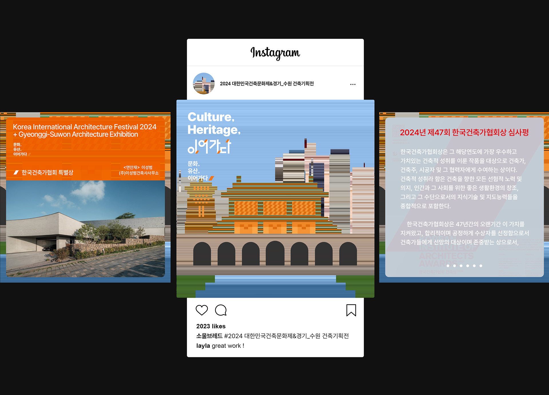
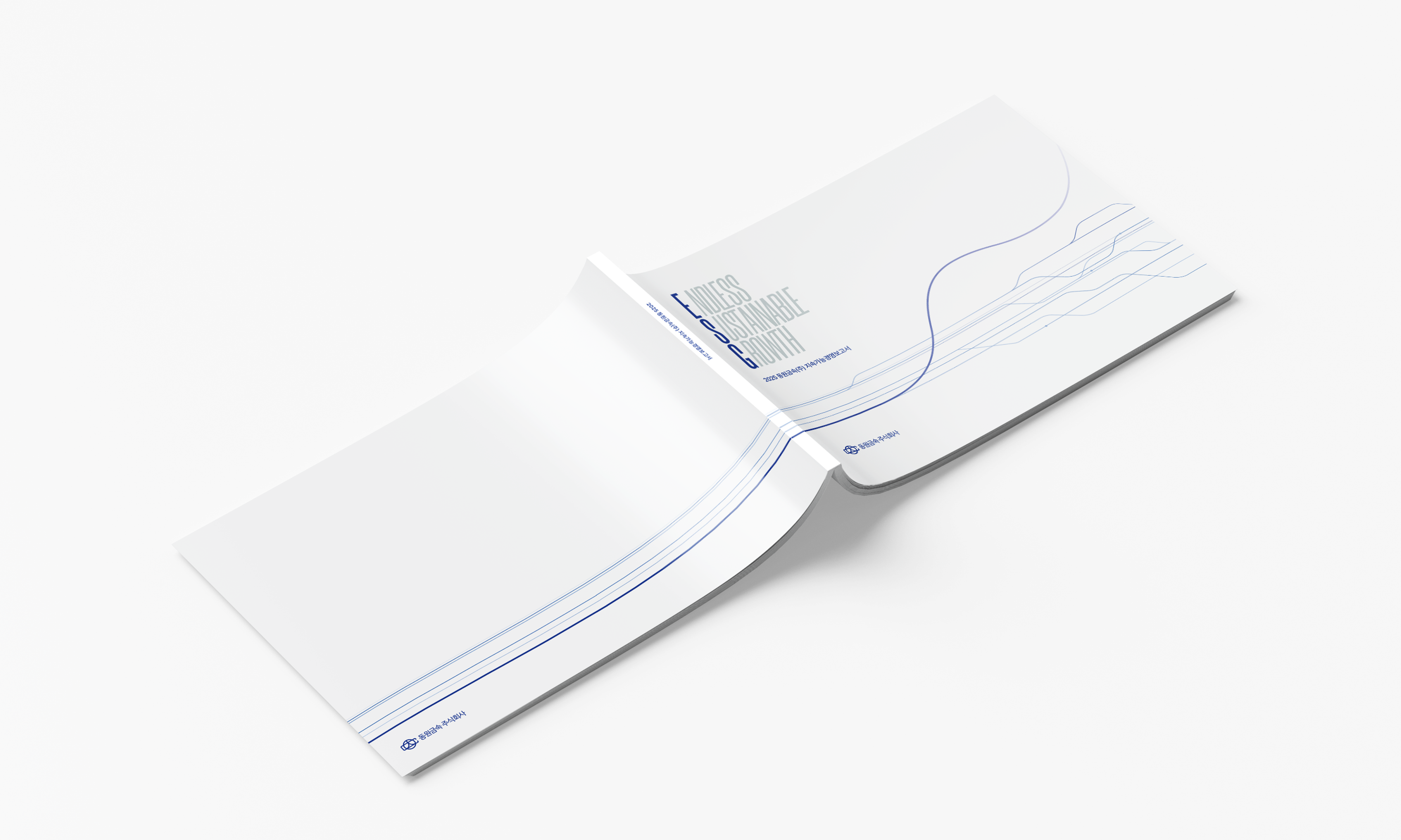
하나의 그래픽 모티브를 중심으로 전개되었습니다. 이 핵심 모티브를 기반으로 다양한 인쇄·디지털 매체에 맞게 형태와 구성을 조정한 바레이션을 제작했습니다.이를 통해 전체 디자인은 일관된 분위기와 브랜드 아이덴티티를 유지하면서도, 각 매체의 용도와 크기에 따라 가독성과 활용성을 높인 맞춤형 디자인으로 완성되었습니다.
즉, 하나의 콘셉트가 여러 환경에서 자연스럽게 확장될 수 있도록 체계적으로 구성한 작업입니다.
즉, 하나의 콘셉트가 여러 환경에서 자연스럽게 확장될 수 있도록 체계적으로 구성한 작업입니다.
This project was developed around a single graphic motif that serves as the foundation of the overall design. Using this motif, we created tailored variations.
By doing so, we maintained a consistent visual identity while adapting each application to its specific size and purpose, ensuring readability, usability, and visual harmony across all materials.
In short, the core concept was designed to scale naturally across different media, creating a unified yet flexible system.